 Microsoft SharePoint can do awesome things, but its interface can be quite unintuitive at times. The result has been that while the number of SharePoint licenses has increased rapidly year-over-year, end-user adoption rates have not followed suit.
By contrast, the Microsoft Office suite of productivity tools has evolved into a leader in intuitive, user-friendly design. The user experience in Word, Excel, and PowerPoint has gotten better and better while SharePoint’s UI/UX went through only minor changes.
In our Future of SharePoint blog series, we talked about the many new developments in SharePoint 2016 and Office 365. One topic we didn’t talk about, but is a common denominator through all of these improvements, is User Experience — specifically, how Microsoft is starting to align its SharePoint product roadmap with UI/UX gains seen in its other applications.
In this blog, we discuss changes to the SharePoint Home Screen.
In future blogs, we will explore options for site branding and the creation of web pages, portals, intranets, and other UI/UX factors that make SharePoint and Office 365 much more compelling for user engagement. After all, that is the work we do daily at Crow Canyon in our applications and custom projects!
Changes to SharePoint Home Screen
Since the early days of SharePoint, users have been asking for interfaces that help them to work more productively. Finally, with the release of SharePoint 2016, Microsoft has decided to apply its productivity tool UX success to the world of SharePoint.
At the front and center of this new aesthetics-based approach is the SharePoint home screen. The new interface is designed to enable users to quickly navigate to their most important intranet sites — the new screen displays existing sites and enables users to create new sites.
Replacing the Sites tile (from the Office 365 app launcher), the Delve-inspired interface uses cards to organize different content areas. Frequently used SharePoint sites are displayed no matter their origin — on-premises, online, or hybrid.
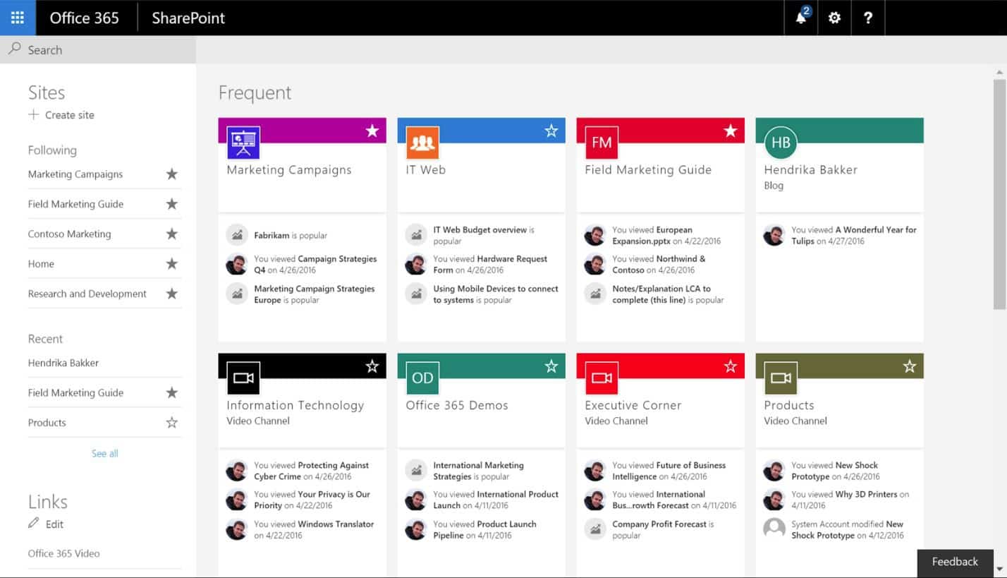
The sites are grouped in a colorful display with Followed and Recent sites on the left in a side bar and Frequent and Suggested sites in the main screen. The Frequent section shows sites that were most recently updated along with your activity in those sites. The Suggested sites, listed below the Frequent section, are sites that the Office Graph engine calculates might be relevant to your work based on your activity in SharePoint and Office 365.
A Search box in the upper left is meant to make it easy to find the sites, files, documents, etc., that you may need. There is also the ability to create sites, as well as other standard Office 365 navigation.
As quoted in the Office blog:
SharePoint home is your new “gateway” to experiences in SharePoint. Our goal is to make it simple and fast to navigate your entire intranet across any device, so you can keep track of the sites, work and people in SharePoint and Office 365 that are important to you.
It is good to see that Microsoft is focusing on improving the SharePoint UI/UX. Perhaps these changes will whittle away at the problem of user engagement and usability, both of which have dragged down SharePoint’s adoption rates.
Meanwhile, companies like Crow Canyon will continue to provide branding, portal, and intranet services that make SharePoint and Office 365 applications truly engaging and useful to work with.