As shown in Part 1 of this blog, Excel Services is a versatile service application that can be scaled out independently to many individual application servers running the ECS (Excel Calculation Server) service.
Users can easily explore data and conduct analysis and Excel Services reports that use SQL Server analysis services data. They can also point to a value and a PivotChart or PivotTable report and see suggested ways to view additional information.
What are PivotTable Reports and PivotChart Reports?
A PivotTable Report:
 Is an interactive way to quickly summarize large amounts of data
- Can be used to analyze numerical data in detail and answer unanticipated questions about your data
 Is an interactive way to quickly summarize large amounts of data
- Is especially designed to:
- Query large amounts of data in a number of user-friendly ways
- Subtotal and aggregate numeric data, summarize data by categories and subcategories, and create custom calculations and formulas
- Expand and collapse levels of data to focus results, and drill down to details from the summary data for particular areas of interest
- The “Drill Down” command can be applied using a single mouse click, allowing a user to access even more detail and conduct analysis
- Move rows to columns or columns to rows (or “pivoting”) to see different summaries of the source data
- Filter, sort, group, and conditionally format the data subsets focus on the specific information you want
- Present concise, attractive, and annotated reports, printed or online
A PivotTable report is often used when a user wants to analyze related totals, especially when there is a long list of figures to sum, with a need to compare several facts about each figure.
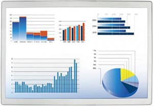
A PivotChart Report:
- Provides a graphical representation of the data in a PivotTable
- Is interactive. When it is created, the PivotChart Filter Pane appears, and can be used to sort and filter the underlying data of the PivotChart report.
- Changes made to the layout and data in the associated PivotTable report are immediately reflected in the layout and data in the PivotChart report
- Displays data series, categories, data markers and axes in the same way as standard charts
- Allows a user to change the chart type, titles, legend placement, data labels and more
You can automatically and simultaneously create a PivotChart report when you first create a PivotTable report, or you have the option of creating PivotChart report from an existing PivotTable report at any subsequent time.
Excel Services enables users to easily view and change which items are displayed in rows, columns, values and filters in both PivotChart reports and PivotTable reports that have been published to Excel Services. Using these comprehensive and versatile report styles will become “pivotal” to your success!
Creative Commons Attribution: Permission is granted to repost this article in its entirety with credit to Crow Canyon Systems.